MiL Institute
Piktör Aktiebolag
MiL Institute
PORTALS OF CHANGE
PORTALS OF CHANGE
PORTALS OF CHANGE
PORTALS OF CHANGE
BRAND ILLUSTRATION
BRAND ILLUSTRATION
BRAND ILLUSTRATION
BRAND ILLUSTRATION
BRAND ILLUSTRATION
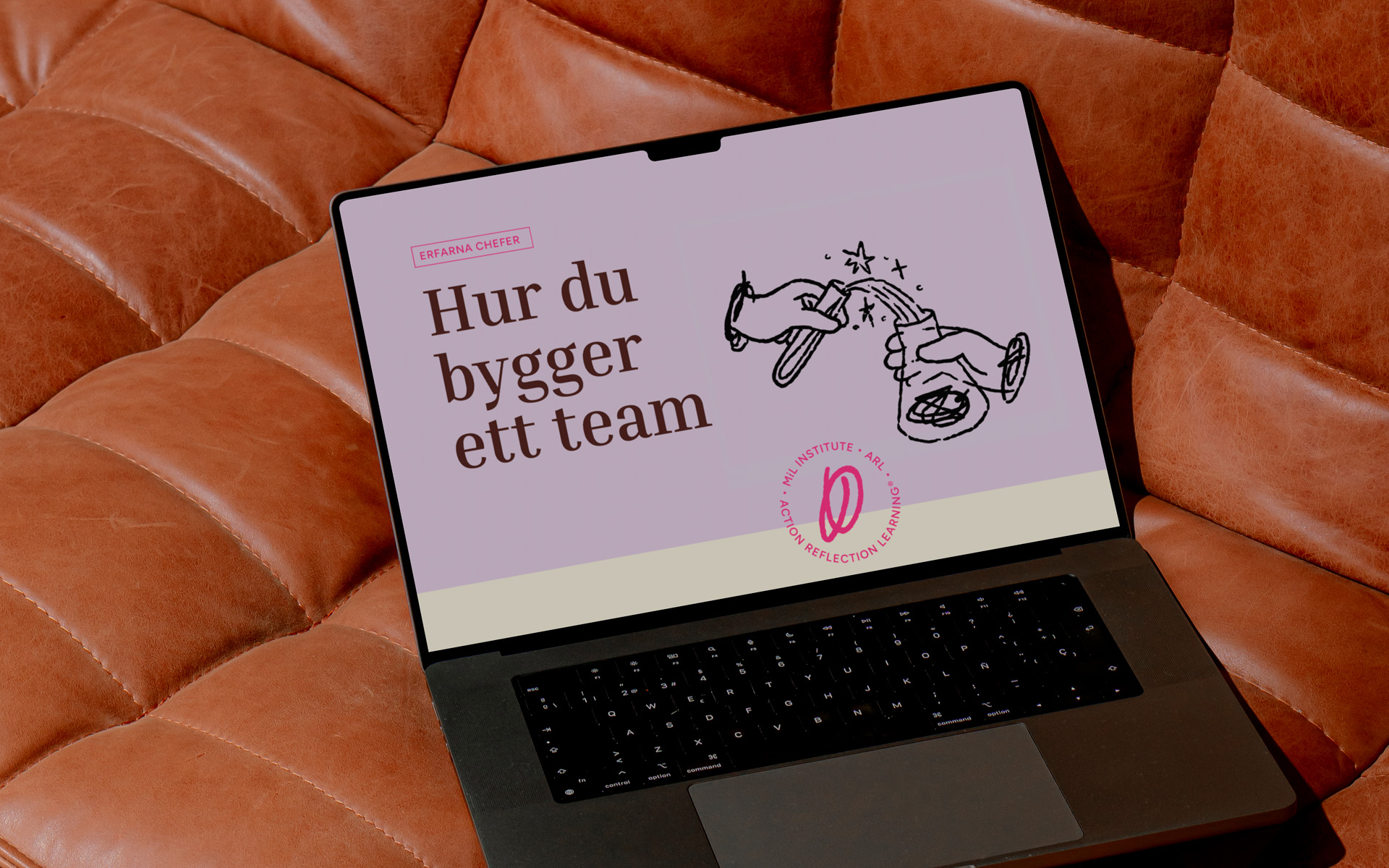
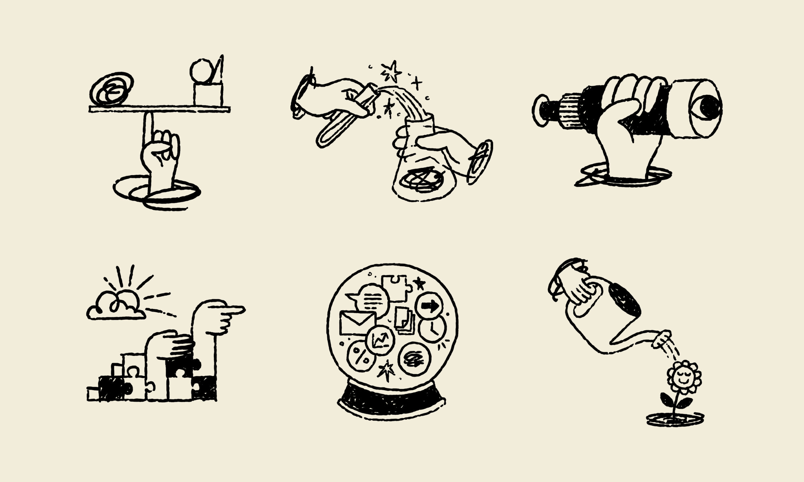
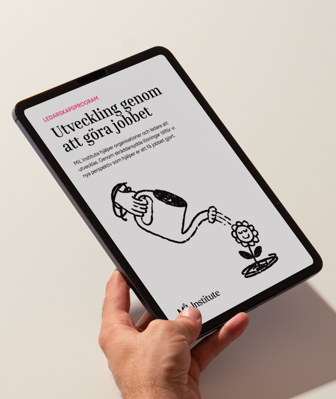
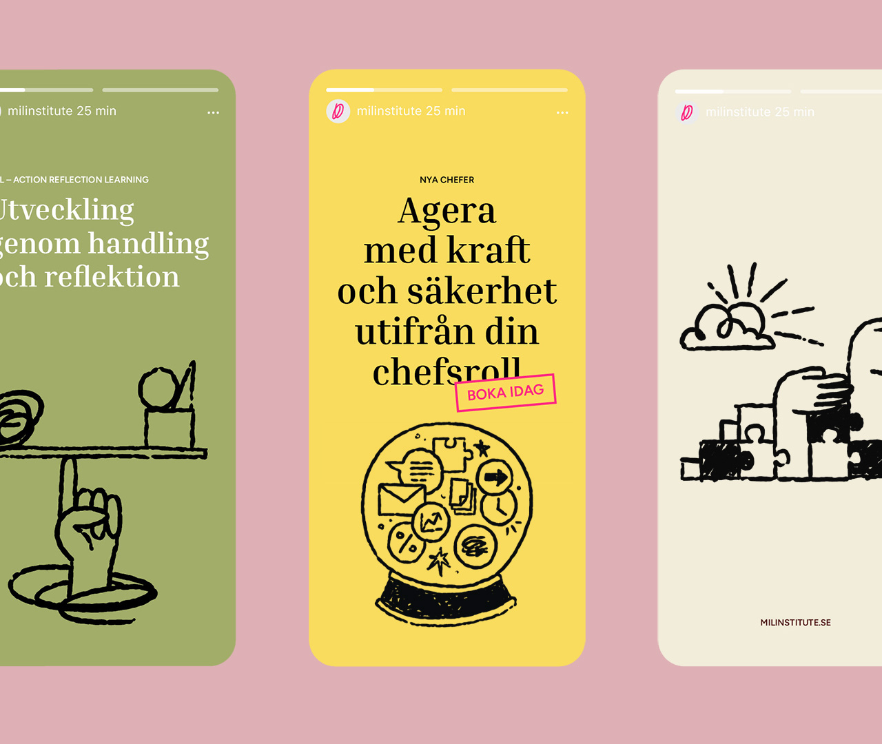
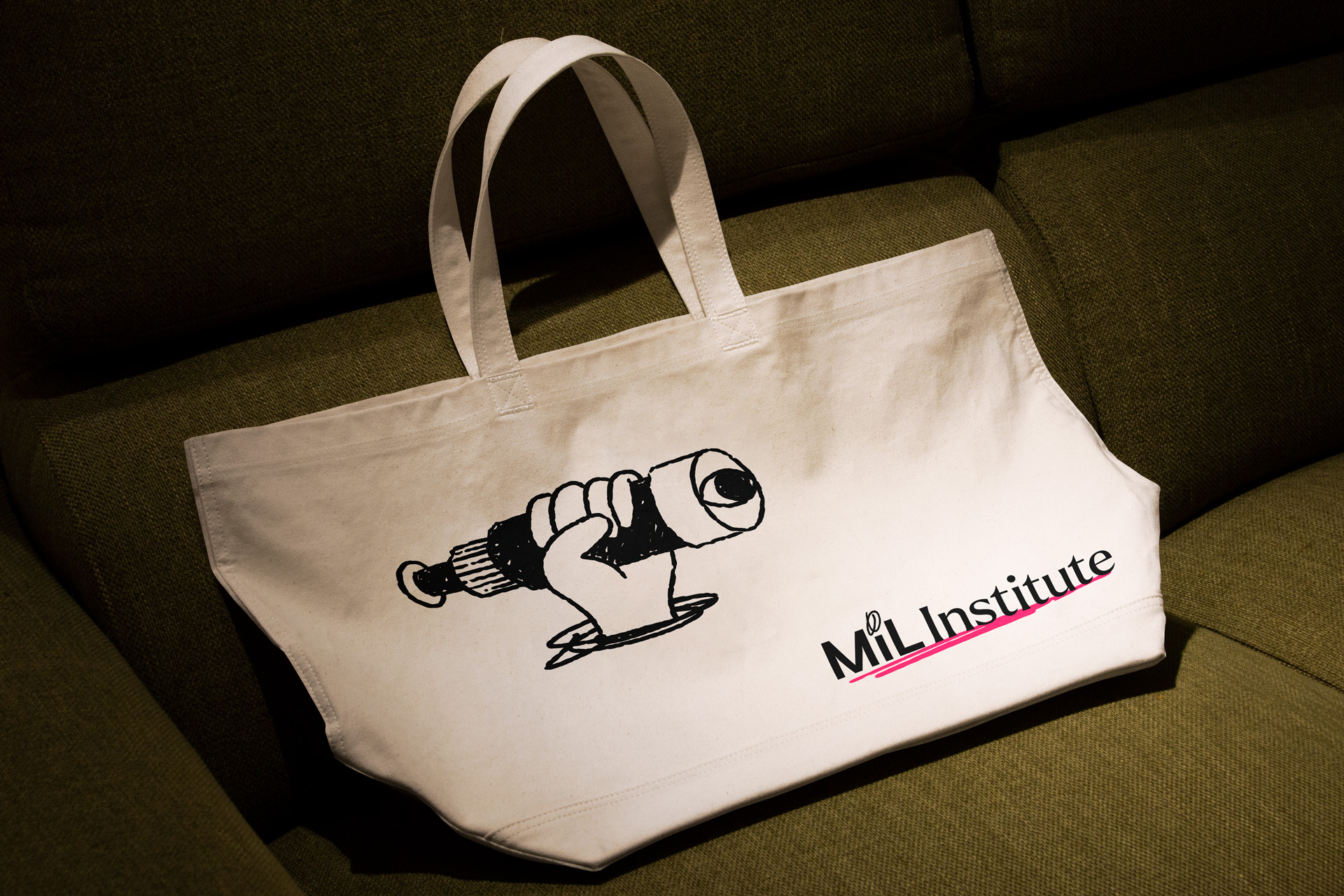
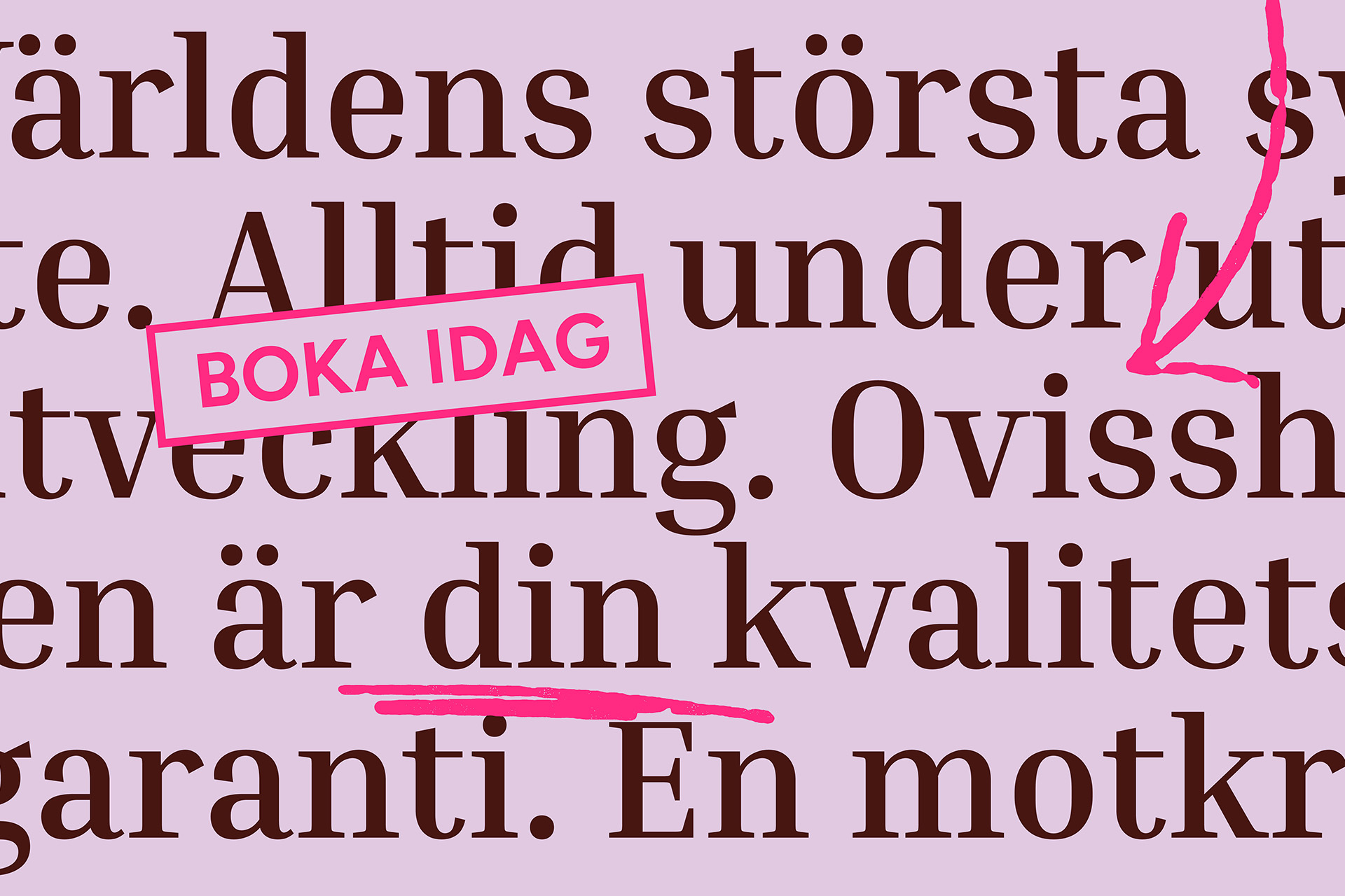
This project was created together with Kolossal Branding & Design, where they developed the linguistic and visual brand identity. I was tasked with creating the illustration style.
The MiL Institute has offered & assisted organizations with development & leadership courses within all sectors since the 1970s. MiL early on gained recognition for their rebellious spirit with a tendency to question overly simplistic standard solutions. This counterforce & spirit still lives on today & was something we wanted to harness when tasked with developing an updated brand identity.
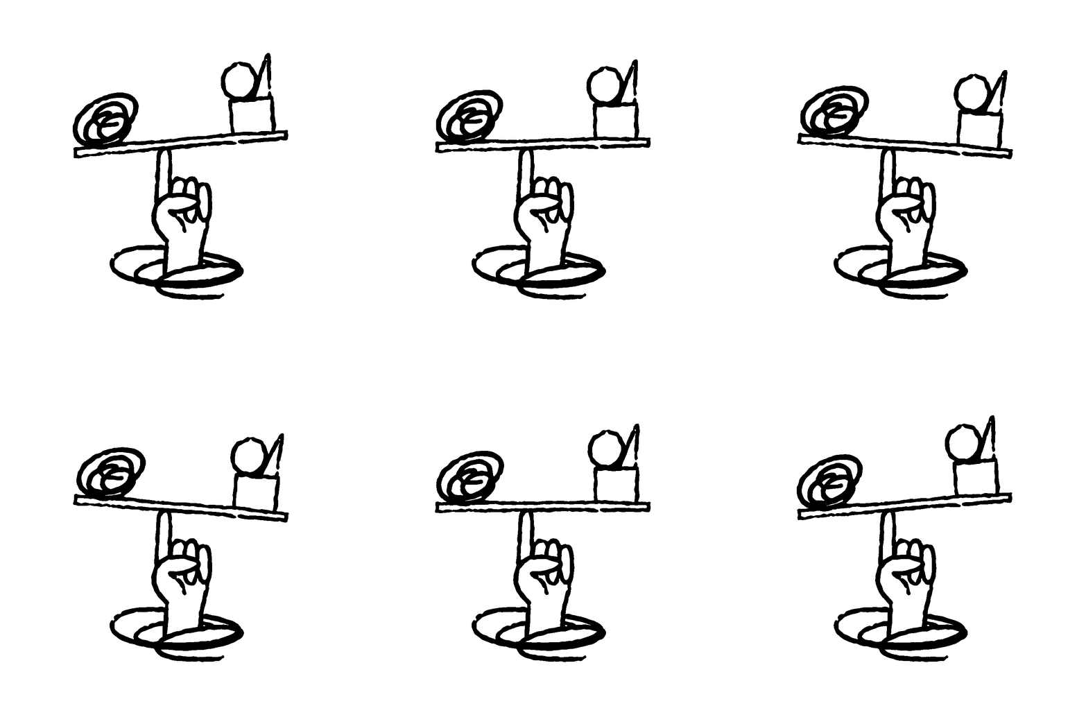
The solution to the illustration style is rooted in the non-linear & dynamic process that characterizes MiL's learning and development courses, where each course is like stepping into a portal of change. The hand-drawn form signifies a human-centric focus & the friction that occurs when different points of view clashes, where the prolonged discussions drive long-term change.




Interested in developing your brand, service or product? No matter if your project is big or small, independent or commercial I'm here to help you stand out.
Start the conversation
Interested in developing your brand, service or product? No matter if your project is big or small, independent or commercial I'm here to help you stand out.
Interested in developing your brand, service or product? No matter if your project is big or small, independent or commercial I'm here to help you stand out.
Interested in developing your brand, service or product? No matter if your project is big or small, independent or commercial I'm here to help you stand out.
Interested in developing your brand, service or product? No matter if your project is big or small, independent or commercial I'm here to help you stand out.
©2024 ANDREAS PEDERSEN. MADE IN MALMÖ, SWEDEN.
©2024 ANDREAS PEDERSEN. MADE IN MALMÖ, SWE.
©2024 ANDREAS PEDERSEN. MADE IN MALMÖ, SWE.
©2024 ANDREAS PEDERSEN.
MADE IN MALMÖ, SWE.
©2024 ANDREAS PEDERSEN.
MADE IN MALMÖ, SWEDEN.